homeaboutcontactadvertise
Showing posts with label Discussions in Design. Show all posts

7.23.2012

"Not me" moments

File under "Shit I Don't Normally Do":

Then file under "Reasons It Was Worth It":
  • Ha Ha Tonka, Cory Chisel and Murder By Death all killed it. The rock-out was continuous for three solid hours (thanks, great music + tequila-spiked coffee).
  • Glutinous rice flour looks hilarious before it's molded into mochi. Imagine microwaving The Blob, then smothering it in flour.
  • My reading nook looks so fucking cool. All I want to do upon coming home is lie on the floor and bask in this birdcage light.
  • The new dress rocks. It's comfortable, it matches my shoes, it makes me feel saucy.

Sometimes it's nice to shake things up a little.

Give me two things you're doing this week that aren't the typical "you." And hey--let me know how it works out, would ya?

11.08.2011

Three Must-Have Books for Every Designer’s Little One

Life’s most profound lessons are often contained within the colorful pages of children’s literature. One of my favorite examples of this is Dr. Seuss’ Oh, The Places You’ll Go!, in which he reminds his readers “you’re on your own, and you know what you know. And you’re the one who’ll decide where to go.” 

In a similar vein, the fox from The Little Prince advises his young friend “one sees clearly only with the heart. What is essential is invisible to the eye,” and Shel Silverstein’s The Giving Tree highlights the beauty of wholly unselfish, sacrificial love. 

What truly sets a children’s book apart, though, is artwork both simple enough to appeal to a pint-sized reader and profound enough to encourage their older counterpart to keep the book open long after Junior has gone to bed. 

While thoughts of having my own children are still faaaaar away on the horizon, the inner (read: blatant) Design Nerd in me has been known to linger in the Kids’ section of bookstores, slowly turning those glossy, oversized pages in awe. So much inspiration can be taken from these whimsical combinations of illustration and typography; when well done, they evoke emotion and linger in my mind for later appreciation. And after all, aren’t those results the main goals of commercial art? 

If you share my unabashed love of the Kids’ section and an enthusiasm for good kerning, take a look at the literature below. I promise you’ll want to read these books to your son, daughter, niece or nephew—or heck, just to yourself—over and over again. 


The Decemberists’ frontman has always been known for his literary tendencies, though he’s expressed them mainly through song in the past. Meloy has now teamed up with his wife to create a story about a young heroine named Prue, who heads out on an adventure into the Oregon wilderness to save her younger brother after he is carried off by a murder of crows.


This Melbourne-based artist and author’s book is a collection of 15 vignettes. Each focuses on a fantastical event that occurs in an otherwise mundane suburban world, including a nut-sized foreign exchange student’s travels and a sea creature discovered in a neighbor’s front yard. 


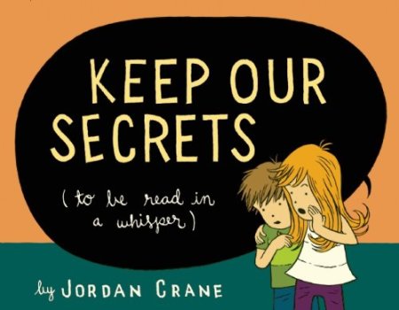
The real magic of Crane’s book about two children exploring their house lies within its chemistry. The thermal ink on each page changes color when rubbed, revealing illustrations otherwise hidden under an expanse of black. So cool! 


What kids' books do you still adore past the days of animal crackers and apple juice?

9.26.2011

Monster Monday & A Call for Help

Monster survived his first crazy party this weekend. Cheap drinks, loud music, extremely confusing card games, he was there for it all. 

And I think he was the only guest who made it into Sunday sans hangover. 

Why were there so many cans in this big white box?

***

So, friends, I have a favor to ask. It’s this little guy’s birthday next month, and I’m putting together a present for him. 


And what’s more fun at any age than music or art? Music AND art, of course! I’m making him an alphabet-themed coloring book, with one musical group representing each letter. Such as… 

I: Iron & Wine


and S: The Shins 


But in doing so, I’ve stumbled upon a few roadblocks, namely the letters Q, U and Z. I can’t think of any worthwhile bands that begin with these! So I ask, dear friends, for your suggestions. What musical greatness do I have yet to discover that will fulfill alphabetical requirements and simultaneously provide artwork appropriate for a pre-school-aged child? 

Ay ay ay. Ayudarme, por favor!

9.06.2011

Tuesday Tunes & Shadow Casting Tutorial

Three hilarious things I’ve learned from a week at my new job: 
  • Always be prepared to take cover from Nerf gun-touting coworkers. No computer screen (or back of an employee’s head) is safe.
  • Nothing fosters interoffice bonding faster than sharing the title and duties of DJ. Turntable allows a group of people to build a collective playlist, listen together, then vote on which songs to keep and which to toss.
  • Clients from Hell are hilarious, but sadly all too real. 

Can you tell yet that I work with a bunch of nerds?
It’s awesome. 

And when I’m not dodging rubber suction darts or jamming to The Black Keys and Kanye, I’m picking up some really valuable design skills. One of the basics I fine-tuned last week was the creation of shadow casts, which are extremely helpful when trying to give the illusion of 3D space within an image. With that, I happily present General Overachiever’s first design tutorial! 

General Overachiever's Shadow Casting 101:
Completed in Photoshop CS5

Although I spend most of my time applying shadows to laptops and cell phones, I thought a bright green teapot might be more entertaining for this personal project. To begin, ensure that the image you want to shadow is on a separate layer from its surroundings. I've renamed mine "teapot" for clarification.


Select your equivalent of the "teapot" layer, then duplicate it by hitting Command+J (Ctrl+J for PC users). This duplicate layer will eventually become your shadow, and I've therefore renamed mine "shadow" to differentiate.


While holding down the Command (Ctrl) key, click small icon of the "shadow" layer within the Layers palette. This will create a perfect outline of your shadow-to-be. Using the Paintbrush tool, you can now paint the entire shadow black without worrying about ruining its shape.


With the "shadow" layer still selected, click Blur>Gaussian Blur under the Filter menu. Choose a radius of anywhere between 4 to 7 pixels.


Now that your "shadow" is blurred, move it behind your original "teapot" by clicking and dragging it within the Layers palette. Although unnecessary, I like to duplicate the now-blurred "shadow" to allow for more customization later on.


With the "shadow" layer(s) selected, choose Transform>Distort under the Edit menu. Manipulate the shape of the shadow by clicking and dragging the handles that have appeared within the image.


Adjust the opacity of the "shadow" layer(s) by sliding the toggle near the top of the Layers palette. In this example, I chose to set "shadow copy" at an opacity of 18% and "shadow" at 40%.


Select your "teapot" and all "shadow" layers to move them as a collective object, then reposition them on the canvas as needed.


And voila! You've just moved from 2D to 3D. Congratulations!

Did you find this tutorial helpful? Are there other tricks you'd like to learn? This is still a tentative series, so any and all feedback would be awesome. Thanks for your time, friend!

7.23.2011

Detecting Creative Ruts

During the process of cultivating one's own "style"--be it in design, photography, clothing, whathaveyou--self reflection is a must. Studying one's own work is not only humbling (I often find myself thinking, why in the world did I choose that pattern? That placement? That cheesy effect?), it's also a good starting point for development. You view your projects more objectively once you've let them age for a while. You're able to see the progress that Current You has made since Past You created that piece of work. Or, in this case, that series of work.

Of the many lessons I've learned through analyzing some of my older photography, one of the biggest is that, well, I take way too many sky shots.


This is just a fraction of the collection. Posting them all would keep you here for a good 45 minutes.

Such a realization doesn't mean that I'll never take another sky-centric photo again; the habit, after all, is still a part of who I am as a creative. But I'd say this is an indication that it's time to try a new angle.

What patterns do you detect within your own work? How do you develop them to keep from getting stale?

7.19.2011

Tuesday Tunes & A Minor Food Freakout

As you may or may not have heard, the Red Hot Chili Peppers are coming out with a new album at the end of August. If you're looking for more information, I'm sure unRonic would be happy to engage in a lengthy discussion with you on this topic. I, on the other hand, will just leave you with the first single. Have played it about ten times in the past hour.


On an unrelated note, here are three words to describe why my job rocks:

Pinch is a new catering company whose business we might utilize in upcoming events. To better acquaint us with their services, they've invited us to a complimentary tasting tomorrow afternoon. 

Uuum, what?


Er, excuse me. I mean...

Miso eggplant egg roll

The spices...

Korean banchan

The desserts...

Beet red velvet cake

The drinks...

Basil gin-ger limeade

I'm simply flabbergasted.

Kimchi bloody mary

Their menu includes butternut squash creme brulee, PB&J funnel cake, broccoli souffle, thyme brioche toast...poking around their website has obviously left me drooling on my keyboard.

But it's not just their culinary offerings that make me gush. I'm also completely infatuated with their design. Simple use of typography, plenty of breathing room and a killer Contact page. An edible and visual feast? Hello, heaven.

When it comes to design, I almost always tend to favor simplicity over complexity. Meghan over at Design Morsels captured this reasoning very well in her comparison of movie posters.

Please note, all photos are property of Pinch. I, unfortunately, have not had the privilege of getting this close to their menu items. Yet.

7.15.2011

Steps Toward Style: Part I

None of my clothes seem to fit me these days.

Don't misinterpret that statement--they do sit on my form the way the manufacturers intended. The skirts flow, the tank tops cling, the belts cinch. But they still don't fit me.

Actually, it may be more accurate to say that I don't fit them.

Having owned the majority of my wardrobe for at least four years (though some of it dates back to high school and even...*gasp*...junior high), these threads are interwoven with a lot of memories. The grungy white flip flops I'm wearing just carried me to the grocery store for a toilet paper run. At age 16, they carried me to Sonic parking lots for late-night cookie dough shakes. And into various high school locker rooms at 17, where I would stash them away in exchange for squeaky clean cheerleading shoes.

Rainy camping trip taken: Summer 2011
Pre-patched denim shorts purchased: Summer 2003

On one hand, there's a richness to be found within such charactered items of clothing. These pieces are forever a part of who I was; they were literally closer to me than any of my other possessions. They will define the decade when high school photos are rediscovered 20 years from now. 

But on the other hand, they're also symbolic of...baggage. Staleness. A way of life that was wonderful in its time, but has since evolved into something new and entirely different.

Plus, I'm fairly certain I'm the only twentysomething who still wears flared jeans on a regular basis. 

I've been working bit by bit to get this makeover moving, but have found it a difficult project to take on for several reasons.
  • Student budgets don't leave much room for frivolity.
  • Big stuff (travelling, anyone?) is going to claim most of my savings.
  • Shopping fucking sucks. It is exhausting. There are price tags and blaring music and ugly clothes, all in your size, and gorgeous clothes, none in your size, and retail employees following you around and SO MUCH PRESSURE.

So instead of rushing to the mall because I think all of my jeans are lame, I'm taking some time beforehand to figure out what I really want. Because at its core, this project isn't about buying new clothes. It's about looking like the person I want to be. I design websites, posters, brochures, apparel; shouldn't I spend time designing my style as well?

Here are a few beginning steps that have already helped immensely. If you find yourself stuck in a style rut--or manhole--try these out.
  • Join Pinterest. Start your own style board. It's such an easy way to organize online inspiration.
  • Take inventory of your current wardrobe. I'm in the process of doing this by photographing all of my clothes. Yes. All of them.
  • Now, study that thing like there's gonna be a quiz. What colors do you tend to keep buying? What textures show up repeatedly? Are you constantly coming home with the same tank top in a different color instead of trying something new?
  • Do not, I repeat, DO NOT go shopping before looking at your inventory. This actually saved me from buying yet another dangly silver necklace yesterday. Instead, I was able to focus on jewelry that complements the pieces I have at home.

Tooooo many tank tops!

Does your wardrobe reflect who you are? Who you were? Who you want to be? Do you go all-out like this when you're ready for an update, or are you a more frequent shopper, buying as the seasons change?

7.12.2011

Tuesday Tunes & Continuing the Creative Discussion

Okay, guys. This is shaping up to be a pretty epic week, which you'll learn more about tomorrow. In the meantime, let's get PUMPED. Although The Decemberists' album Hazards of Love beats out their newer The King is Dead in my book, "This Is Why We Fight" is more in tune (no pun intended) with life lately.


The feedback received on Sunday's Questions for Creatives was, to keep it short, awesome. Many thanks to Flight of The Tumblebee, Design MorselsAcquired Tastes and Add To The Heap. You each brought some great insight to the table that was definitely worth getting excited about. I'm full to bursting with creative mojo; hopefully you ladies were able to gain something as well from the introspection!

*Raises wine glass in cheers to empathy and collaboration*

To add just a few more thoughts to our discussion, here are the steps I've taken this week to keep my energies focused:
  • Creating individual folders for all of my current projects in Google Docs. Now wherever I am--Midwest, East Coast, office, apartment--I can upload progress and bits of inspiration on the spot. No need for a digital folder on my laptop, a physical one on my nightstand, etc. It's all. In. One. Place.
  • Consolidating my random, sporadic lists inside a single planner. Because lists aren't helpful when they're lost.
  • This last one I haven't finished yet, but am making progress: identifying each of the projects on my plate, focusing in on those that rank high in importance, then scrapping the rest. Once that's finished, I'll set some deadlines to ensure that they don't fizzle out or drag on past their time.

Go Go Gadget Organization! Whew.

More relaxing activities this week include baking Irish soda bread and mapping out upcoming adventures. Some with this guy:

Sandy fingernails.

And a few with this girl:
Shoes optional. Always.


7.10.2011

Questions for Creatives

The title of this post is a bit of a misnomer. It assumes that today's writing is directed only toward those who confidently describe themselves as "creative," but are countless individuals who actually possess and exercise a great deal of creativity without ever recognizing in it. cough MOM cough. cough LIZ cough.

Therefore, whether or not you identify with this adjective, please keep reading. I have a few questions for you.

As one who is continuously striving to stretch my personal limits and break down the walls of my comfort zone--chiefly in design, but also in what I eat, what I read, what I listen to and where I travel--I find the ideas and opinions of others to be extremely helpful. Delving into the crazy twists and turns of another's brain is always an adventure. I may have gazed up at the clouds today and said they look like elephants; you, on the other hand, may have spotted the Pyramid of Khufu.

Cloud gazing and creating echoes in southern Kansas.

Out of genuine curiosity, I'd love to know:

  • Through what medium do you normally express yourself? Are you a writer? A painter? A baker? Or do you choose to dabble here and there as the mood strikes?
  • When you begin a new project, how do you choose to start? Do you plan it out first, mapping the steps and setting deadlines? Or do you dive in without more than a second thought? And either way, why?
  • How do you stay organized? Or do you even make the effort? Why or why not?

How do you focus?

I'm endlessly trying to stay more focused, more organized, more productive...but without fail, I end up getting stuck in ruts. As we all do, I suppose. Current ruts include Facebook, email and (this one's new) Google Analytics. Thanks a lot to Campfire Chic for that last one. This leaves so little time to finish the projects I've started that the days end up feeling more chaotic then ever. Which leads to frustration and lack of motivation, rather than increased creativity. Yaaaargh! Do you struggle with this cycle? And if so, what helps you to overcome it?
Related Posts Plugin for WordPress, Blogger...